Email and HTML: 10 mistakes to avoid

Is creating emails that are effective and perfectly optimized for mobiles a prerogative of web designers and coders? Not anymore, thanks to the advent of modern drag & drop editors that write the code for us. But having some basic HTML and CSS knowledge is a fundamental skill for those in email marketing.
This is why we wanted to focus on some of the more technical aspects of the email world. We’ll examine those that often remain in the dark, but which are of fundamental importance for a strategy’s success.

From developing integrations to strategic support, from creating creative concepts to optimizing results.
❌ #1 Using overly verbose code
In some respects, HTML and CSS tags perform the same function. Let’s look at a practical example, establishing the background color of a table in both HTML and CSS.
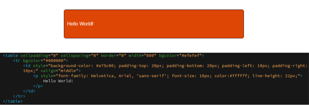
Orange is defined for the background in two points:
- bgcolor=”#e75c00” (in the tag table);
- background-color (in CSS).
These two attributes do the same thing: command an orange background. They overlap, weighing down the email with redundant properties that perform the same function.
Our recommendations:
- Keep the code as clean as possible
- Avoid unnecessary repetitions
- Try to keep the code as ordered as possible through indentation (there are several online services that do this, like HTMLformatter or Clean CSS), to be able have an overview of the structure of the communication
- Keep track of the history of macro-changes made to the template.
❌ #2 Excessively commenting on the code
As with most languages, it is also possible to add comments to HTML, so as to add “service communications” to the written code, or simply “notes” on what needs to be completed or improved.
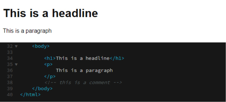
Comments can be useful, but remember not to abuse them: although the email recipient doesn’t see them, the comment remains in the communication and weighs it down.
❌ #3 Not defining the email’s content
When designing an email, even before writing the code, always remember to define some parameters that will serve as guidelines for subsequent communications and must not be modified during the implementation phase.
Let’s see some parameters:
- Email width
- Image size
- Number of images
- Font size used in the header
- Font size of the main text.
To quote Bruce Lee: “Content is like water, if you put water in a cup, it becomes the cup; if you put water in a bottle, it becomes the bottle”.
Therefore the text, the image, or the call to action must adapt to the structure, not vice versa.
Our recommendations:
- Define all the parts of the template
- Stay consistent between the different parts of the communication
- Respect the rules you have given yourself
- The rules can be broken, but this must be done with full awareness
- If the template doesn’t meet your needs, consider defining a new one.
❌ #4 Getting phone numbers and interactive addresses wrong
As you know, many companies include some contact information in the footer. These are critical elements when it comes to an address and phone number, especially on mobile. Why?
- It is actionable information: all it takes is a click to open an app that will manage the data (calendar, phone, navigator)
- The display space is reduced.
The problem is often the graphic rendering, between unsightly blue links and random underlining.
You can intervene with small workarounds to overcome these graphic differences, breaking some rules with the HTML code.
When it comes to the phone number, it’s simple: since the anchor tag lets you define a telephone number by using tel in the href property, add the telephone number without any spaces or separating lines.
An address or date must instead be treated differently. For these, you need to define a class (address) that imposes the anchor tag to automatically insert the color within the client (color: #ffffff;). Above all, it should remove the underlining, which is a default feature of each link (text-decoration:none;). Note that both attributes of the address class have !important, which must be applied by the client regardless of the property. Without it, there is no guarantee that the workaround will do its job.
❌ #5 Not cleaning up abandoned or empty tags
Continuing with the objective of trying to keep the overall weight of the email to a minimum, pay attention to the parts of the existing code that no longer have content. Need an example? A <font> tag, perhaps with a series of inline styles, that does not contain any text. Nothing will be read in the email, however the tag continues to exist, unnecessarily weighing down the email.
❌ #6 Using non-validated HTML
Code validation is a free application created by W3C to help designers and developers check cascading style sheets (CSS).
W3C helps us by indicating errors and suggesting corrections. Thanks to this tool, it is possible to identify and correct larger structural errors.
Although it makes sense to have clean code that is as close as possible to the W3C standard, this is not always possible and companies are often forced to add a series of workarounds to the solid structure, a sort of fine-tuning that will extend the correct display to as many clients as possible.
❌ #7 Using images that are too heavy
We are all careful about how graphics are displayed in emails, and how it will impact the recipients. All this care can however be nullified if the medium, the email, is not considered.
Especially because the bandwidth is not infinite: this is why avoiding the insertion of excessively heavy images is essential.
A few recommendations:
- Maintain a maximum weight of around 50 KB
- Make sure the image resolution is 72 dpi
- Save images in JPG, GIF, PNG format
❌ #8 Overly-heavy emails
Marketers often insert images created for another purpose or another support (an advertising campaign, the website, and so on) in an email. Without taking certain precautions, the height and width of these images will not work within the email.
The HTML tag img helps optimize them, letting us define the height and width of an image. For example, the following line of code sets the height at 123 pixels and the width at 456 pixels.
<img src=”[percorsoImmagine]” height=”123″ width=”456″>
Once the parameters have been set, regardless of the actual size, the image will be displayed on the browser with the specified height and width.
❌ #9 Inserting non-optimized animated GIFs
Animated GIFs certainly add a lot of emphasis to a message: they are an extremely effective means of capturing attention. Furthermore, inserting them in email is very simple.
But you must be very careful, considering that the size of an animated GIF rapidly increases depending on both the number of frames of the animation and on the dimensions.
But above all because some clients don’t see the animation at all: Outlook 2007-2013 only displays the first frame. What should we do then? Make sure that the very first frame is comprehensive and complete so that the message is understandable even if the animation is not activated.
❌ #10 Forgetting the alt text of images
As you know, by default some email clients don’t display images, but that’s not all, because many users prefer to disable them (for various reasons).
How to buffer these situations? With a few code properties:
- title, which allows the display of an image’s content when the mouse pointer is positioned over the image area (mouseover)
- alt, which defines the text to be displayed if the image isn’t uploaded (alt text).
Our recommendations:
- Make sure images always have the alt and title attributes set
- Do not make the inserted text too long, as it could ruin the layout ofthe communication (for alt) or be difficult to use (for title)
- Make sure the color of the alternate text is easily readable both interms of size and color, especially when you have a colored background
- Preferably leave the alternative text underlined with a link so thatits function is easily recognizable inside the communication.
Share this article
